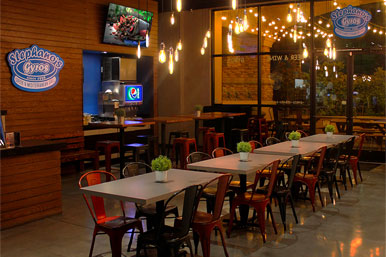
As an element of interior design, space planning is something that the average person does not think about until it works against them. Space planning is important when it comes to the functionality of an area from a room in the house to the entire office building. It maximizes a space whether it is a new build or a retrofit. Good space planning can also positively impact the appeal of a store so that new customers will want to buy something and recommend the business to their friends and family.
Las Vegas is one of the fastest-growing cities in the United States. Even with economic disruptions and closures over the course of the pandemic, Las Vegas still attracts visitors and businesses each year. For a business to thrive in their market, they need to optimize their space to attract buyers and facilitate a positive customer experience. Retail space planning in Las Vegas through commercial and interior design is a benefit to every business.
3 Elements of Retail Space Planning
Atmosphere
All it takes is one look or smell to attract a customer to a store. The benefit of a brick-and-mortar store is that it is a sensory experience for shoppers. The decor, scents, and music can bring in the clientele that is ready to buy, so it is important to make it all work for the store’s brand.
The view through the window at the decor of the shop’s interior tells the potential customer what is available and the lifestyle they can live if they shop there. Posters and sale signs are strong visual cues when they are set in the optimal spot. If the floors are dirty and the windows are smudged, customers cannot see past that. The same is true if the lighting is too bright or too dim.
Smells stimulate shoppers too. A purse store that sells leather wares smells better when it smells like leather rather than a musty back room.
Once inside the store itself, the visual appeal of the fixtures sells the store and its products. While many shelves and counters that date back to the grand opening are still in relatively good condition, it is important that they are still well maintained. Worn-out veneer or chipped glass is a turnoff. Even a reset or interior update can improve the function and interest in a store. A newer-looking store appears to have new products that buyers do not have.
Fixture Placement
Decompression zones are often the critical space in retail spaces. Once a customer comes through the door, it is their first impression of the store and the brand’s aesthetic. They make their mental game plan as to where they want to browse first or what style attracts them the most. It can be a space that has sightlines to different zones and paths that lead them there.
A customer’s mobility in a store is important. If they feel crammed in between racks, they are not able to see all of the products that are for sale. The same is true if they keep bumping into fixtures or have to turn around to go in a different direction because the flow of traffic is not conducive to a positive shopping experience. There can be a misconception that a store should put out as much product as possible in order for it to be sold. However, too much product hinders and even overwhelms a customer. Fixtures that fit the space have a better function than those that can hold all of the available inventory.
Negative space can also help the customer. When there is too much to look at, the neutral color of the store wall is one of the visual breaks that can pace a shopper. Signage can also slow down a customer so they can consider the store around them, the lifestyle it sells, and the range of products available to them.
Product Placement
Fixtures allow for a variety of product placements. Window displays attract customers while high spaces can show where items are located or promote a brand sold in the store. End caps are another use of space to promote the various merchandise on sale or seasonal deals.
Products that are placed around eye level are generally more likely to be noticed. New items are brought to the front and center to bring attention to them, while some products can be blocked or grouped together in tiered displays or formations. The location of a product promotes visibility or visual appeal
Other products need a different kind of placement method. Logical placement such as alphabetical order for book authors is one idea unless new releases need to be displayed by publication date. The best way for space planning would be the one that the customer understands and gravitates to.
Impulse purchases benefit from the right product placement. Fine coats need space of their own, but the accessories that enhance their styles such as scarves or hats can be placed with or nearby to demonstrate the lifestyle it conveys. A section in a store that sells greeting cards may have transparent tape or scissors hanging from a strip next to the display for customers who need to stock up on their gift wrapping supplies. Clip strips or small displays in these targeted areas can maximize space and increase sales.
Successful commercial design in Las Vegas stores will appeal to buyers because the atmosphere, fixture and product placement will lead to a positive customer experience and potential repeat business. At the same time, the right layout and design will satisfy the employees who work and maintain the store each day. Their positivity and job satisfaction due to their environment will increase their productivity and eagerness to sell. These three key elements in retail space planning can be easy to imagine and implement. For best results, consulting with a commercial interior design firm from Las Vegas can bring these elements and more to life.

