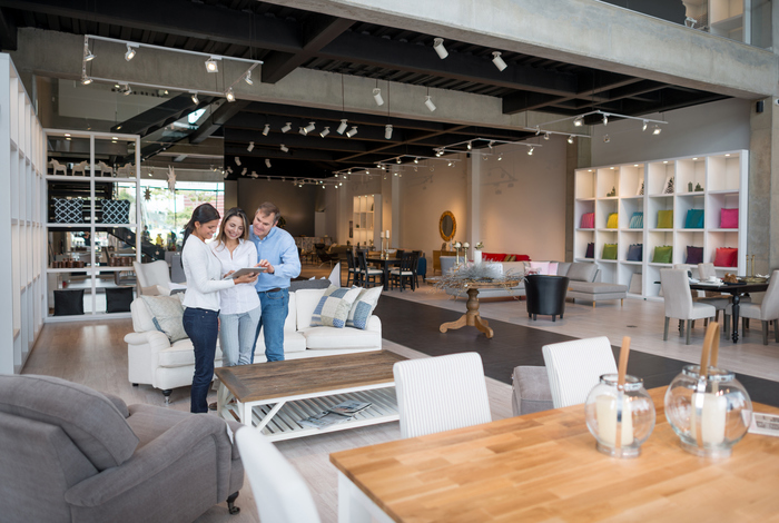
With the ease and convenience of online shopping, brick-and-mortar stores are forced to fight a little harder for the attention and business of shoppers. Retail stores must work to make shopping appealing, enjoyable and convenient extending from the staff and merchandise down to the design and layout of the store.
Shopping, by nature, is a highly visual activity making the appeal of seeing an item in person at a retail store relevant still. Your store, however, must first catch the attention of your customers with retail design that will appeal to in-person shoppers. Here are 8 retain design ideas that can be helpful for boosting sales:
1) Let Your Layout Guide Your Customers
Choosing the layout of your store isn’t always easy, but it can play a significant role in guiding customers to your best products. In order to do so, take the flow of traffic, customer tendencies and the design of your displays into consideration.
Studies have found that shoppers tend to follow a flow of traffic that matches vehicular traffic. For example, shoppers in the United States seem to turn to right first, while shoppers in the U.K. seem to turn to the left first. With this in mind, you might first design a layout that guides customers counterclockwise through your store placing the most enticing displays to the right of your entrance.
Research on retail traffic patterns isn’t always enough to determine the in-store traffic however. It often provides a good place to start, but you’ll need to monitor customer tendencies as they walk in and then set displays that will meet the eyes of your customers.
2) Keep The Entrance Of The Store Open
The entrance of a retail store, known as the decompression zone, is an area where you want to avoid putting important displays or products. As shoppers enter a store, they are often distracted as their mind is preoccupied deciding which direction to go and thinking about what they want to see. Because of this, they mindlessly walk past displays and products located in this area. Try to keep this area open and avoid placing key items or fixtures here.
3) Surround Your Checkout Counter With Impulse Buy Items
27 percent of customers waiting in line to checkout will make an additional purchase of items located nearby. Take advantage of the space around your cash registers to feature items that are easy to grab, inexpensive and enticing for customers.
4) Design Natural Breaks In The Flow Of Traffic
As customers shop, they often skip over displays simply because they don’t grab their attention. It’s easy to zone out and move forward when aisles and displays all look the same. To avoid this, create visual breaks within the aisles or sections of your store that will break up the monotony and keep your customers intrigued.
5) Create Focal Points In Your Displays
While you probably want to entice customers to buy anything, and everything, in your store, it’s important to remember that you can’t draw attention to it all. Instead, design focal points at each display that will highlight a specific item or grouping of items. Position other products in a way that will draw attention to the highlighted items. A good focal point will be more effective in catching a shopper’s eye and consequently promote all items in the display.
6) Make Sure To Declutter
A common visual turn off is a store with too many products and merchandise out on the sale floor. It can cause customers to feel overwhelmed and it can also disturb the flow of traffic as they move through your store. Minimizing the amount of merchandise you display can create an open feel to your pace and allow you to showcase items more effectively.
Keep in mind that customers want ample space to move around comfortably without brushing up against a stranger. They want to feel relaxed as they shop and will avoid stores or displays that disrupt that.
7) Be Strategic With Your Signage
Signs should be placed positioned wisely so as to provide customers with information they need without overpowering the merchandise. Creating eye-catching signs that provide necessary information on products or promotions can help to improve the shopping experience of your customers.
8) Update And Rotate Displays
Shoppers don’t come to your store to see the same thing every time. They come back to find something new or different, so be sure to change your displays regularly in order to highlight a variety of products.
Heather Allen Design Group
5275 South Arville Street #104, Las Vegas, NV 89118
(702) 547-1616

