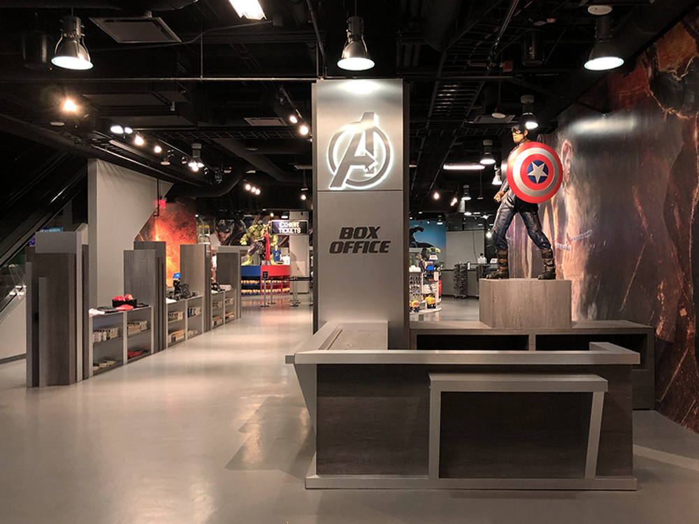
Critical Considerations to Maximize Retail Space Design for Las Vegas Retailers
It’s not just about tying into your brand’s style and ethos, although those are important, too. The right retail space design for Las Vegas stores will also affect employee morale and productivity. Achieving that unique combination is easier said than done, though.
Whether you’re building out a brand new store, retrofitting an existing building, or rebranding your current store, you will also need to consider several factors. At Heather Allen Design Group, our specialists provide you with the concept, planning, and design services you need.
Exterior
While it might not be included in some traditional definitions of retail space, Las Vegas store owners cannot afford to ignore the exterior of the property. Granted, you likely have little control over some aspects – the property’s management company will be responsible for things like lighting, cleaning, and the like. However, it is imperative that you make the exterior of the store as appealing to your target demographic as possible. One way to do that is through visual merchandising in the windows. Creative, evocative merchandise displays and signage achieve many goals, including:
- Communicating your brand’s qualities and focus
- Highlighting products
- Communicating your sense of style
Decompression Zone
The area just inside the doors is what’s called the “decompression zone” and it’s a critical part of retail space planning for Las Vegas stores. While your exterior sets the tone and begins to build expectations about the experience, it is the first few seconds once they step foot in the store that really cements their experience. This is your chance to make the best first impression, and your customers will be assessing things like:
- The look and feel of the space – Industrial chic? Luxurious and high-end? Casual and laid back?
- The products you offer – Are they front and center? Professionally merchandised? Cluttered and disorganized?
- Your brand’s aesthetic – How does your brand stand out in the space?
Keep this area as uncluttered as possible. Signage, shelves, product displays – these can all make it harder for your customers to get a feel for the space and may actually. You should also ensure that your customers can easily exit the decompression zone (most will instinctively move to the right).
The Flow of Your Space
Whether you sell high-end purses and leather goods or health and beauty products, the flow of the space has to be just right. You must balance open space with shelves and racks. Graphic designers have a similar challenge with whitespace. Define clear paths for your customers so that they can easily move through the space, around your merchandising, and feel confident while doing so. Ask yourself:
- Is the flow of my space well defined?
- Are the walkways within my space spacious?
- Is it easy for my customers to see everything?
Visual Breaks
Once you have the right flow, it’s time to add some complications – visual breaks that get your customers to stop and say, “wow”. When it comes to retail concept design, Las Vegas business owners must highlight merchandise and messaging they want their customers to digest, and that requires getting them to pause long enough to notice the merchandise or message, and then to absorb it.
Achieving that two-fold goal can be done in a number of ways. One is to create displays that make customers physically pause and consider the contents – end caps, floor displays, wall displays, and other options can help you do just that. Another is to find a way to display in-depth information about a product or product range while still creating an aesthetically appealing display that connects the product with the customer’s desires, as well as your brand.
Your Cash Wrap Area
Call it a cash wrap, point-of-sale, or checkout, but by any name, this is a critical aspect of retail space planning. Las Vegas retailers must understand that this area is more than just a place for your register and a cashier. It should be a natural extension of your space that ties into the flow of the store but also integrates with your brand.
The design of your cash wrap is as important as any other part of the store. Too often, retailers overlook crucial elements here, such as the use of the back wall behind the registers for branding – think brand-supportive murals and other artwork. You can also use this as space for impulse purchases and add-ons (laces and polish for shoe stores, for instance), but don’t be afraid to push the boundaries here and do things that align with your brand even if it’s different from what other retailers are doing.
Pay Attention to Lighting
One of the most overlooked considerations when it comes to retail space design in Las Vegas is lighting. Lighting affects everything from the mood of your space to your customers’ ability to see and interact with your merchandise. You must go beyond the bare minimum here, too – those fluorescent lights really don’t do your products justice, nor do they help emphasize your brand. Natural light from windows, spotlights and track lights, dimmer/brighter lighting depending on the time of day, and even Edison bulbs may play a role in your lighting design.
Putting It All Together
Effective retail space design for Las Vegas businesses is complex, to say the least. At Heather Allen Design Group, we’ve worked with clients across different industries to create one-of-a-kind interior designs perfectly suited to brand, personality, and audience. Contact us today to schedule your consultation and learn more about our retail concept design services.
