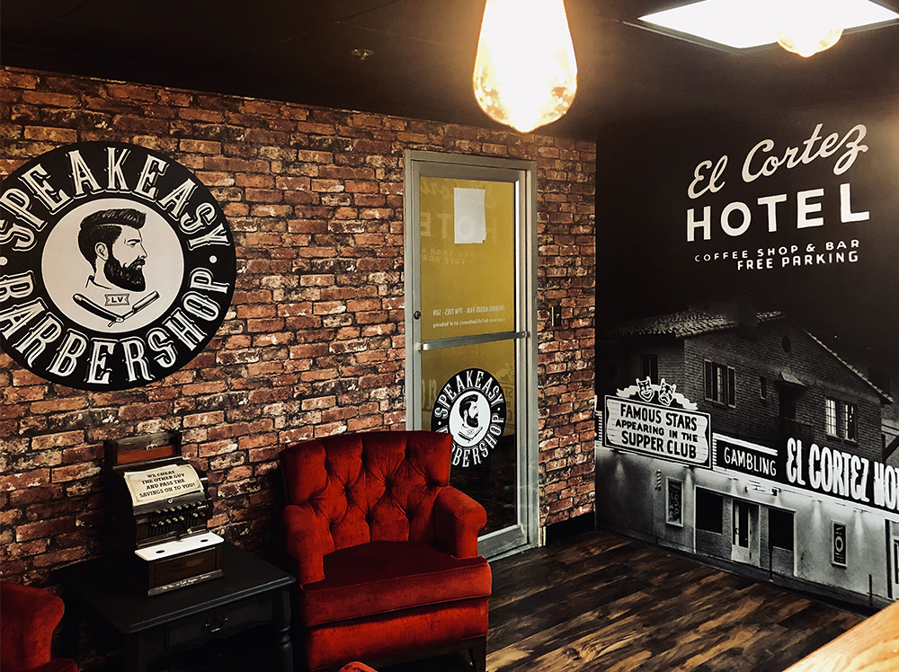
The marketing practice of visual merchandising has been around for quite a while now. Still, it has become a more prevalent and necessary strategy, as competition is getting tougher and attention spans shorter. Everything from the window display to the hue of the lights inside a store can factor into a brand’s image and influence a customer’s decision. With a market that is so saturated, visual merchandising helps stores gain a competitive edge.
But what is effective visual merchandising? What are the different techniques used, along with their benefits?
What is Visual Merchandising, and Why Is It Important?
The retail industry uses visual marketing as a marketing strategy to use visuals to attract customers. This can be done in a wide range of ways. Everything, including floor plans, technology, lighting, décor, and color themes, sets some kind of impression about a business on a customer who’s passing by. The aim is to motivate customers to engage and generate better sales. It can be a powerful way to make a statement, promote the image a brand wants, and increase customer engagement when done right.
The Job of a Visual Merchandiser and the Different Techniques They Use
A visual merchandiser is born out of an exciting and distinctive combination of design, marketing, and retail expertise. An excellent visual merchandiser should understand the unique blend of style, design, and marketing strategy it will take to sell a product by tempting customers through any of their senses. This same blend cannot be used on two different products; excellent product knowledge is vital in selling well.
To achieve this, visual merchandising groups in Las Vegas take advantage of and employ the use of several factors, such as
- Point of purchase display
- Store layout
- Exterior displays
- Lighting
- Ambience using scent, music, light
A point of purchase display is a collection of products displayed and placed strategically for the customers to grab on their way to the checkout or when they’re strolling between aisles. For instance, a store could have two aisles dedicated to chocolates, candies, and snacks of a similar nature. Apart from these two dedicated aisles, there could be a small showcasing at another point in the store with a customized collection of products from those two aisles for the customer to pick up on their way around the store. It could be said that the goal is to tempt the customer twice. Point of purchase display is a pretty effective method of visual merchandising in Las Vegas.
The store layout is a hugely significant factor, frequently used in retail visual merchandising in Las Vegas that can make or break a store. An ideal store layout creates a comfortable and pleasant experience for customers and encourages them to explore the whole store. It should also make the general upkeep of the store easier because that can influence the times customers return to a store and ensure longer reliable customer relationships.
The perfect type of store layout depends on the kind of experience a business wants its customers to have in its store. There are several layouts, including a grid, racetrack, and a free-form layout. A grid layout is best for stores where customers drop in to make quick runs. There’s no perusing happening. Generally, this could be used in a grocery store or a supermarket. For stores that want to push their customers into coming into contact with every product in the store at least once, a racetrack layout might do the trick. It’s a layout that ensures there’s only one path for the customer to go through. Finally, a free-form layout is for those stores that have a more laid-back atmosphere where customers can take their time to browse and wander. Each has its perks when used appropriately.
The exterior display is the first impression a store makes on passing customers. A good exterior display can be the difference between a customer walking into the store to check the rest out and a customer who decides to keep walking. It’s a brief introduction to the store and should be an amalgamation of the best of what a store has to offer. A tip for attractive exterior displays is to follow what’s trending. This could mean putting together seasonal displays.
Once a customer has made it into the store, the ambiance does the rest of the work. Lighting has an enormous influence on customers’ decision-making, focus, and mood. Generally, bright lights subconsciously make people move around faster, while gentler lighting will encourage a slower, calm mood. The time customers spend inside a store is directly affected by the type and levels of lighting used inside. Lighting can also move customers’ attention to specific products by putting them under a sort of spotlight.
In addition to lighting, music, and scent play a massive role in setting a store’s ambiance. It’s proven that music affects customers’ purchasing decisions. A light, slow tempo music floating in the background motivates customers to stay for longer, browse more thoroughly, and more likely leave with a purchase. However, each store’s goals are different. A store catering to formal clothes for working men and women is less likely to play pop music than a store selling clothes for teenagers. Pop music playing in the latter store will motivate customers to stay longer and purchase.
Different scents have different effects on people’s psyche. Vanilla is usually a calming effect, while chocolate or cardamom-like scent is warmer and drives productivity and focus. Scent can often be neglected while setting a store’s ambiance. Many stores have an unpleasant smell, which has an unbelievably massive effect on how long a customer is likely to stay in that store.
Each business and brand has a personality. A visual merchandising firm in Las Vegas can help figure out what that personality is and communicate that personality effectively to generate better results in customer satisfaction and sales generation.

